AAE
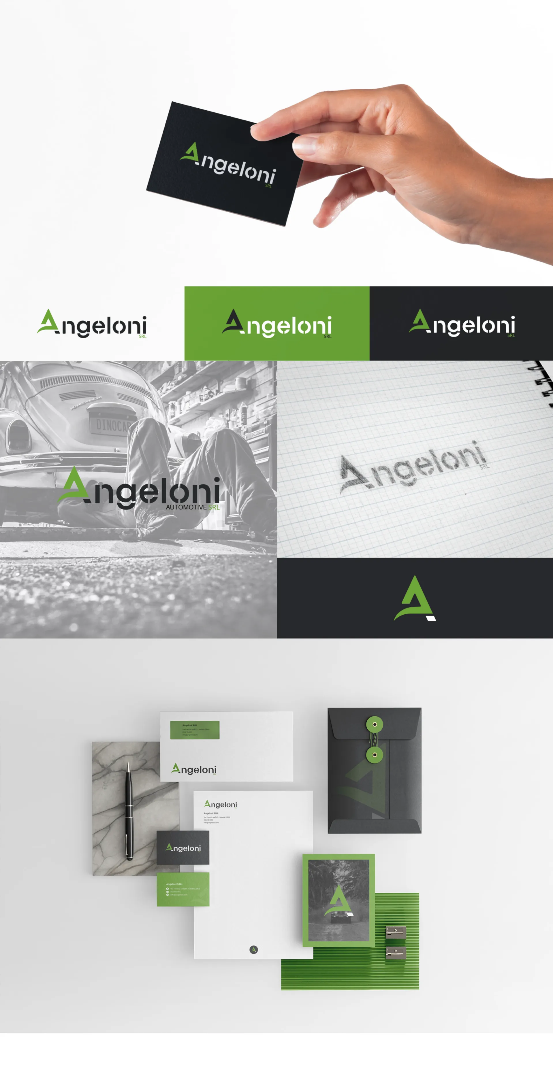
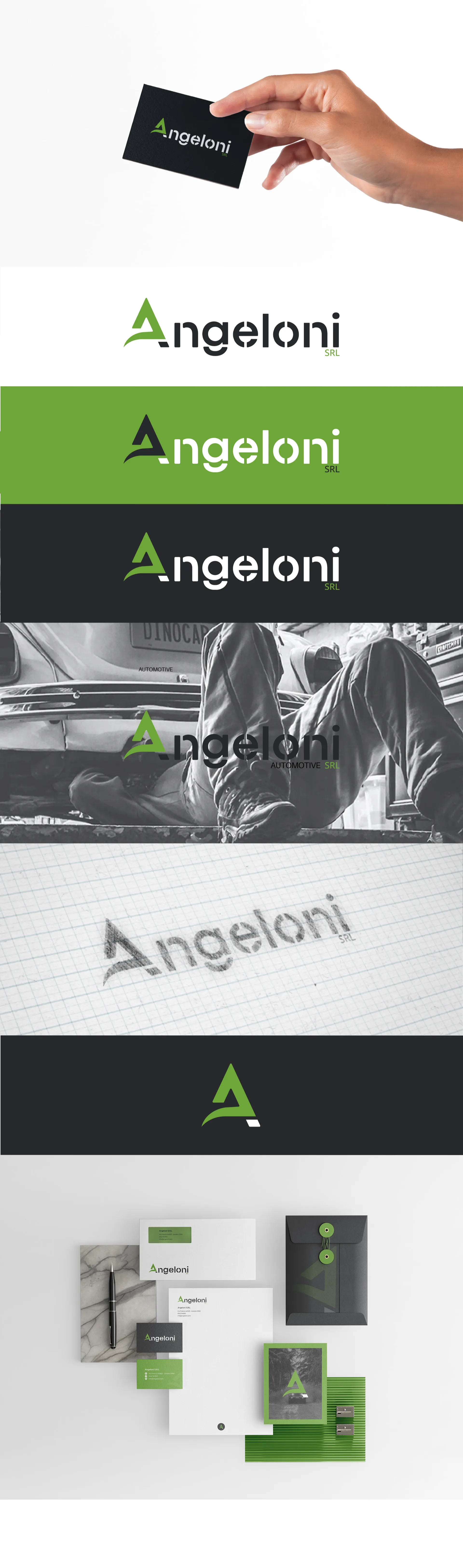
The new logo stems from the idea of creating a modern and fresh version of the brand without disrupting its already locally recognizable visual identity. Therefore they wanted to keep the original curvatures i and colors of the characteristic letter A of the surname Angeloni that was previously closely connected to the automotive industry.
The entire surname is incorporated into the new logo to create a more versatile brand that can be used in different business sectors. The font that was placed alongside the new letter A was created specifically by presenting the same type of breaks on the letters.